Yearbook design and layout
Project: Danforth Collegiate & Technical Institute (DCTI) 2015-16 Yearbook
Category: Project planning, theme development, photography, photo retouching, layout, final production
Timeframe: September 2015 – April 2016
A year to remember
The ask
In the fall of 2015, a new yearbook team was needed, and the staff advisor asked me to lead based on my CommTech and Art teachers’ recommendations. I embraced the opportunity as a logistical and creative challenge, and also a way to improve my Photoshop and Illustrator skills. The length of the book was set at 96 pages. It needed to include staff, student and capture life at Danforth that school year, but the overall flow and content specifics were otherwise up to the team.
The deliverables
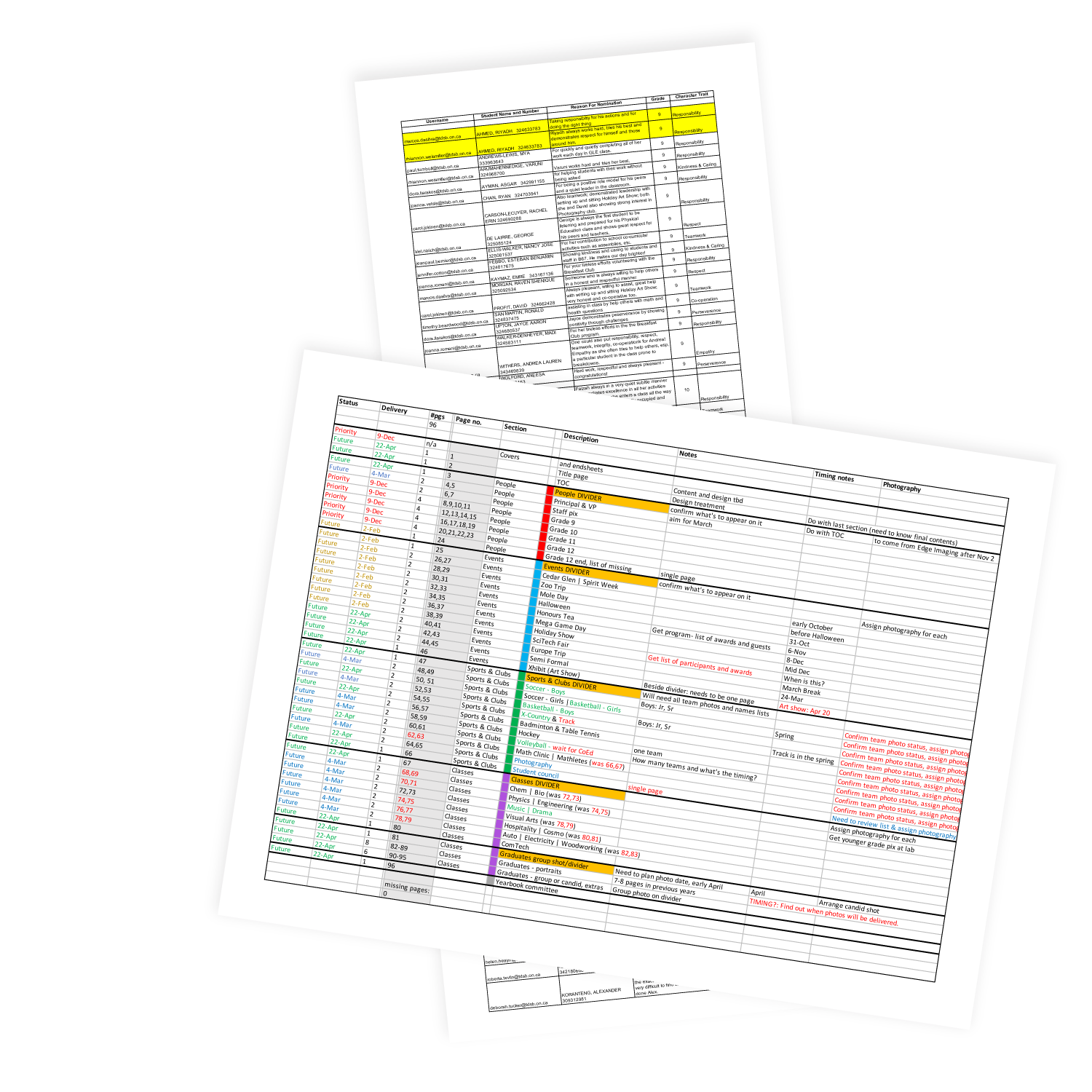
- A thematic construct and pagination plan
- Photographic and text content
- Page layout design and production file delivery to the printer: 96 pages plus cover
”We didn’t realize we were making memories, we just knew we were having fun.
Winnie The Pooh
Drivers
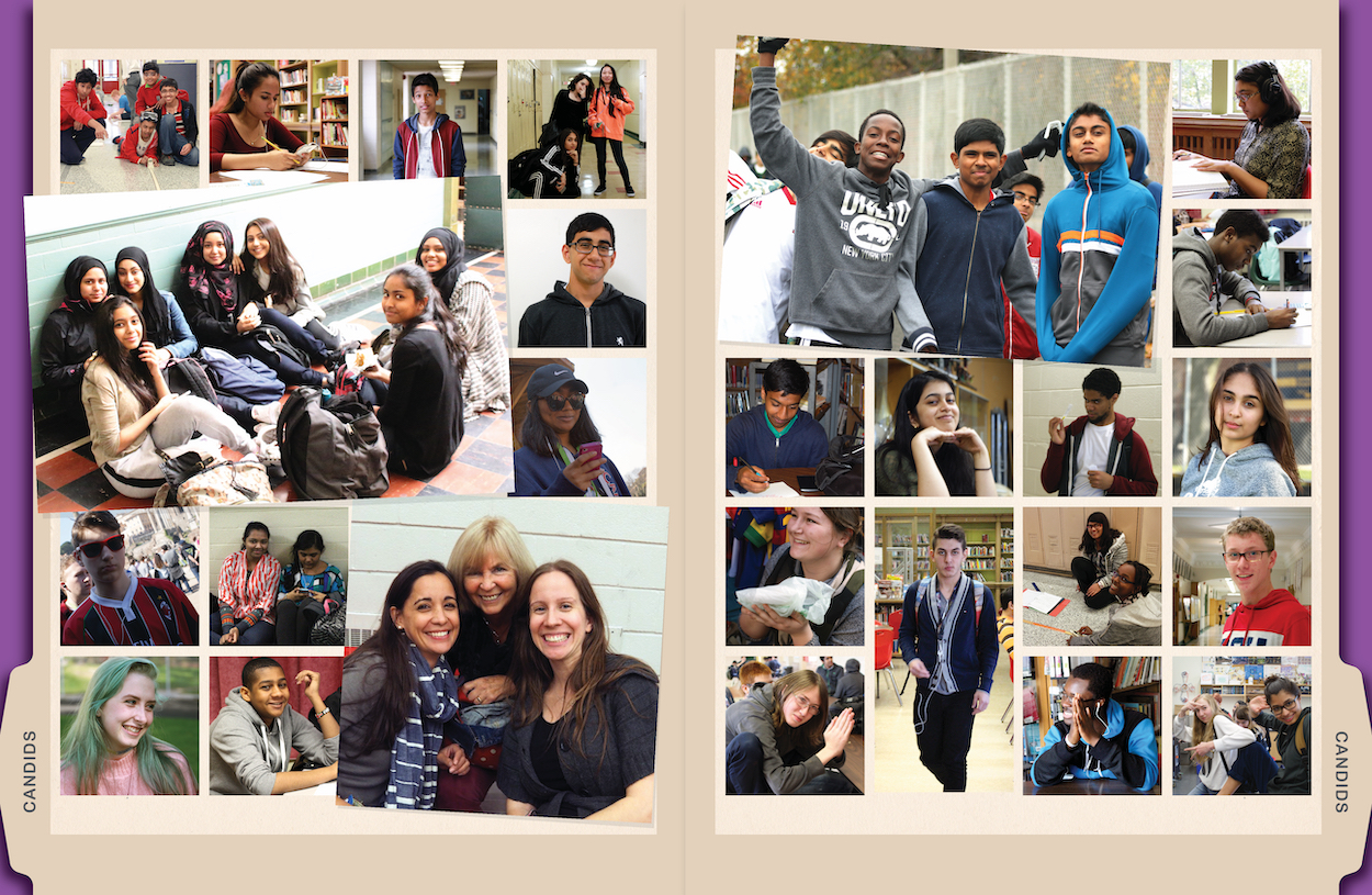
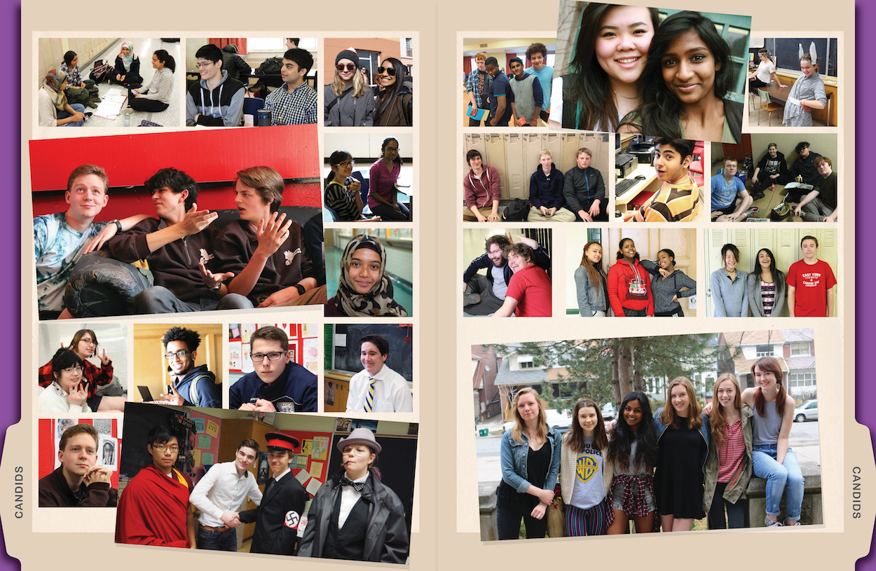
With over 900 staff and students at the school, capturing the breadth of their involvement and interests would be key. In reviewing previous yearbooks, our team found that an emphasis on events and clubs meant that the general daily life of the school was missing. We determined to develop a structure that would address this, and also give more emphasis to including more photography in an effort to include more of the school community.
Part 1
The vision and plan

I developed the theme that was selected by the committee: “Classified files” was conceived to create a sense of inclusion within a special group (i.e., the Danforth school body), while providing a fun and elastic visual framework of many bits and pieces collected into file folders. This physical and tactile approach allowed each page to be given a personality, and for the layouts to be unpredictable and therefore more interesting.
Part 2
The design process
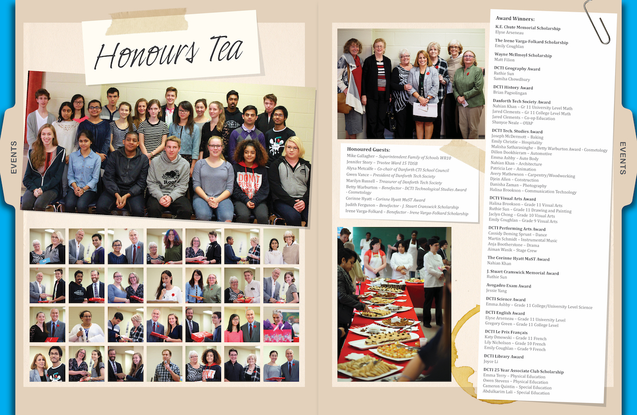
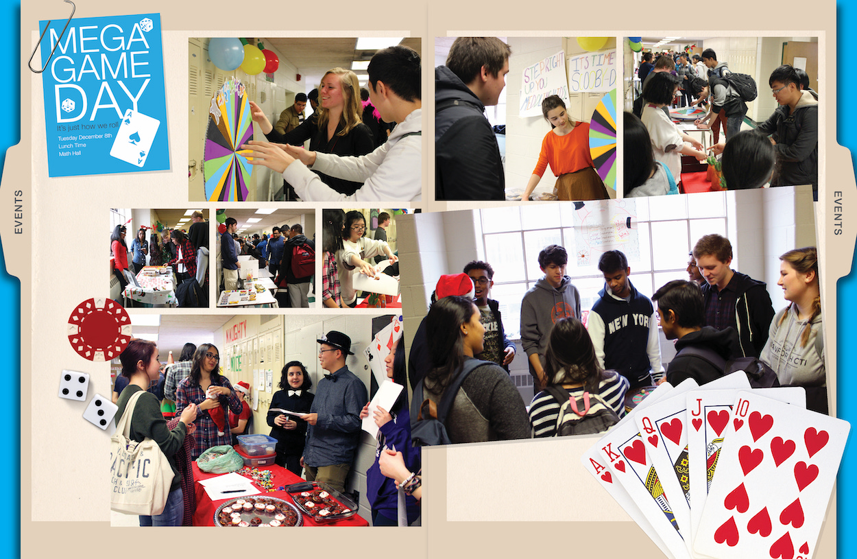
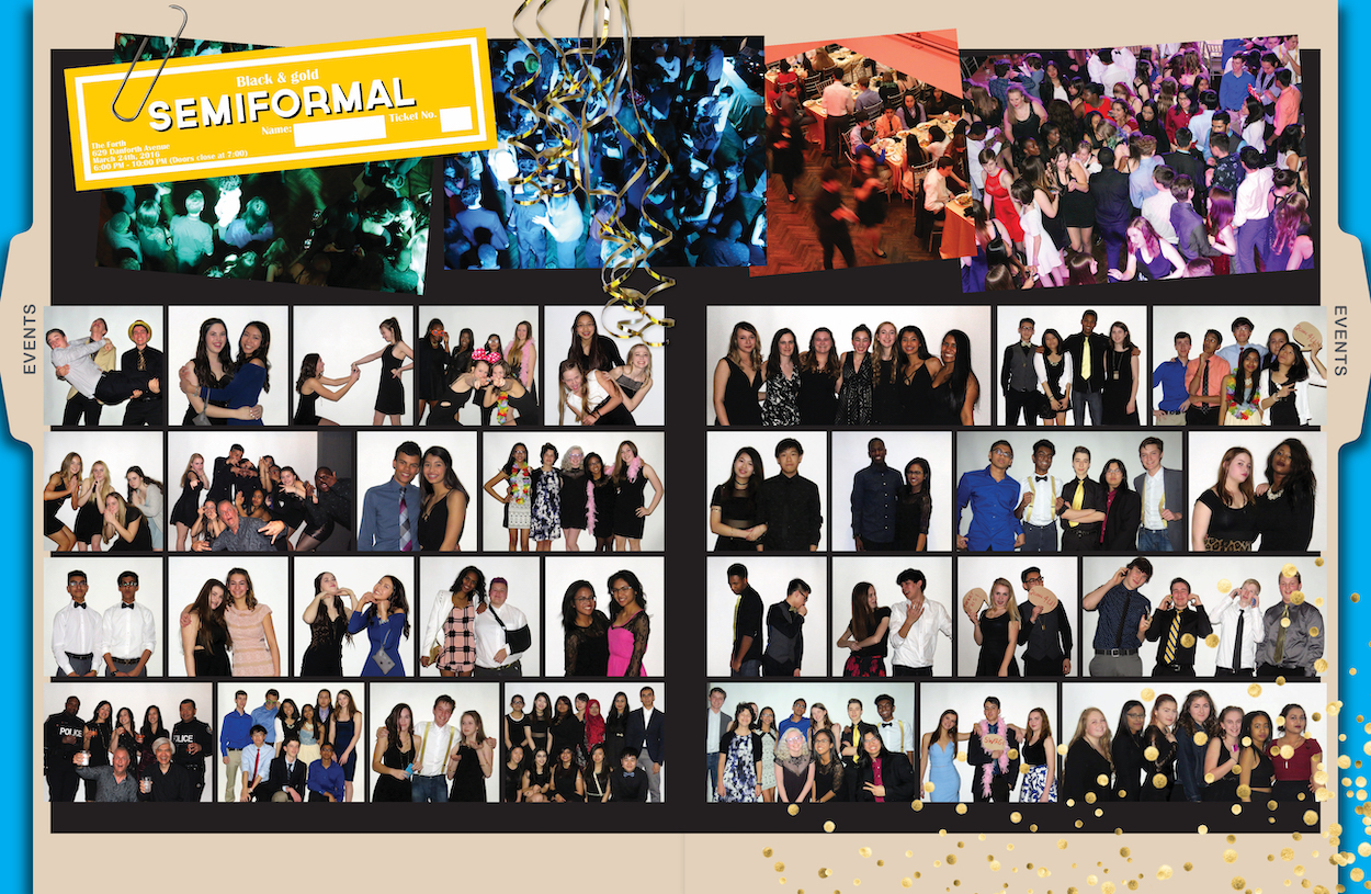
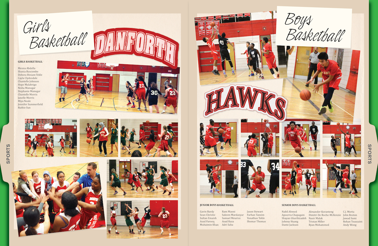
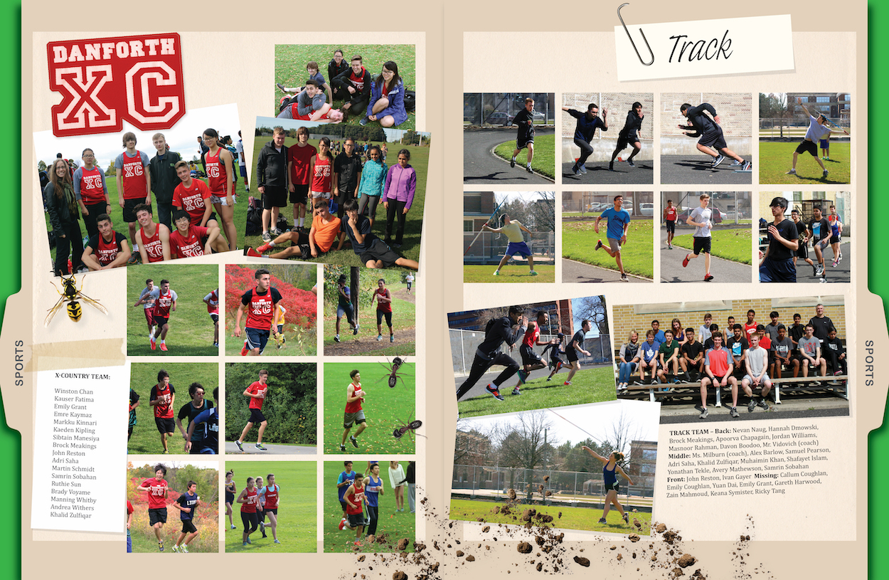
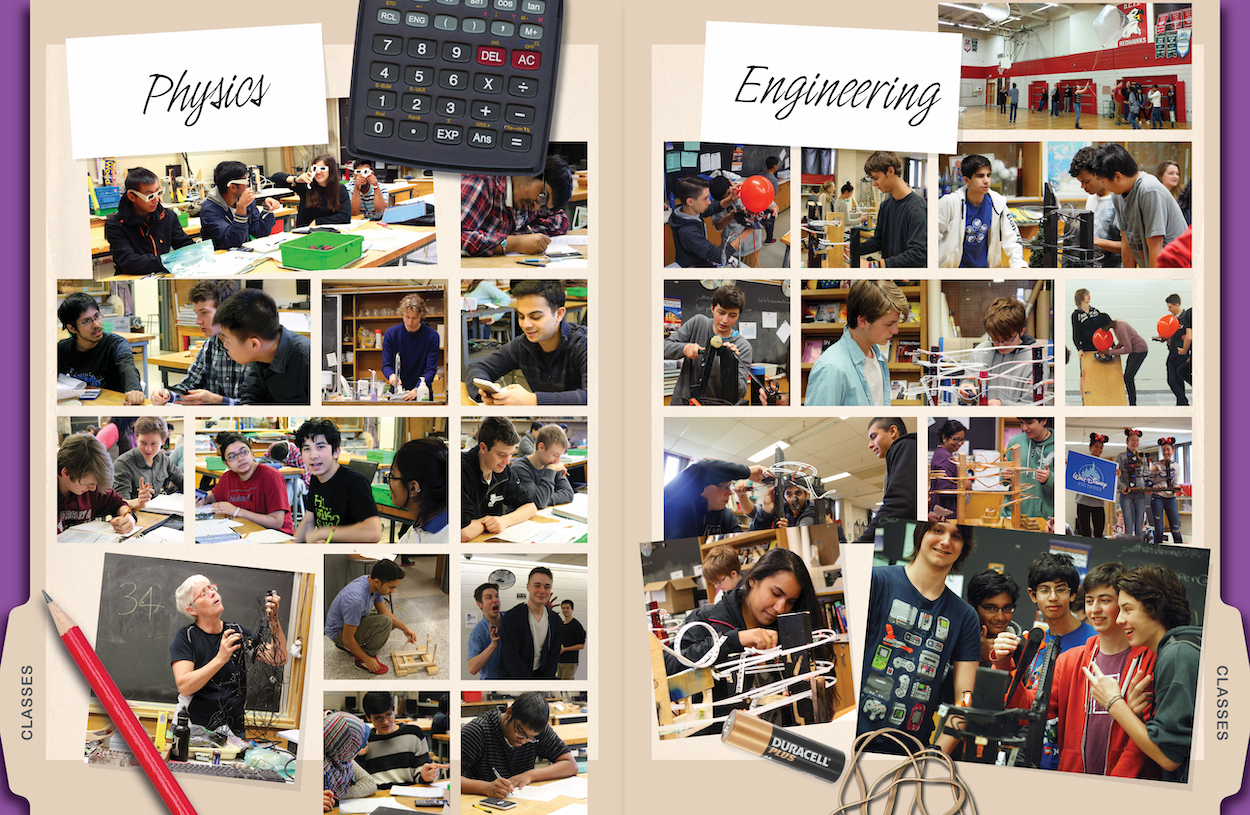
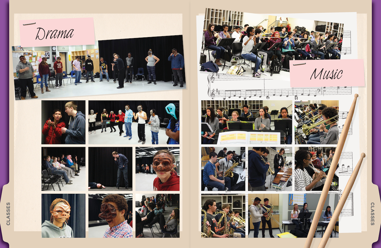
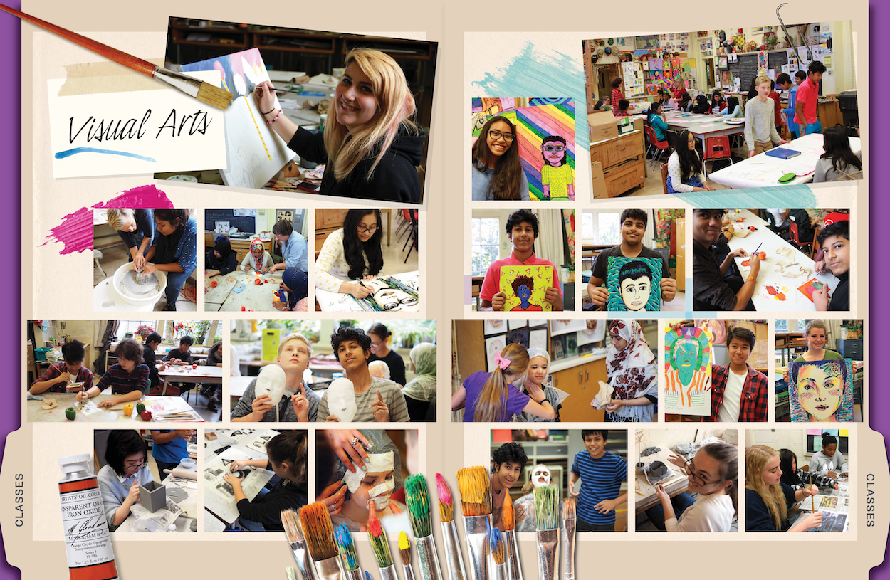
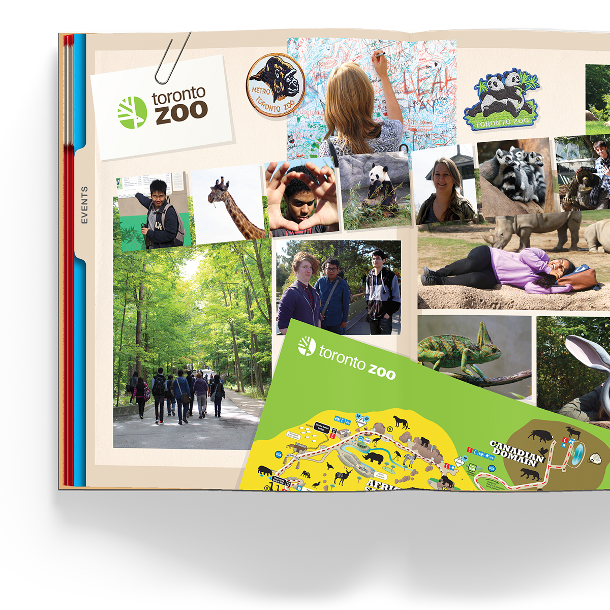
With a plan in place, I set to laying the design framework. Knowing from observation that people would want to look at what was relevant to them in the book – and not read it through from front to back – I wanted to establish an easy way to navigate through the book. I combined the file folder idea with colour coding, to create and easy visual reference, using the “thumb edge” of the book as part of the design consideration. Rubber stamps, stickers and Post-It Notes formed the basis for title treatments, and “real” objects like paper clips, popcorn, masking tape, tickets, spiders, fabric team crests and more were mixed in with photos. The cover became a string-tie envelope as a visual metaphor for the secret file.
Outcomes
We received incredibly positive and exuberant feedback on the yearbook, and this was a resounding validation of all of the hard work and hours that went into its creation. I personally learned so much about how to set up and follow through on a large design and production project. A tremendous bonus was that through the project, I became even more connected to my school, meeting people outside of my grade bubble and extracurricular focus.

