App redesign
Assignment: George Brown College (GBC) Project Management course project – app redesign
Category: Project planning, research, UX, UI, design, video
Timeframe: October – November 2016
Navigating life at school
The ask
As part of a project management course, we worked in 5-member teams to develop a full project plan for something that would bring benefit to GBC students. A budget range of approximately $30,000 – $100,000 was the only other parameter given.
The deliverables
- Needs analysis and user research
- Project definition, prioritization and full plan including requirements, detailed schedule and costing
- User experience mapping
- Prototype creation and testing
- Project pitch documentation and pitch video
”Knowledge is power. Information is liberating.
Kofi Annan
Identifying the opportunity
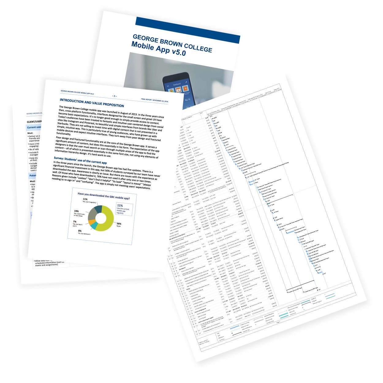
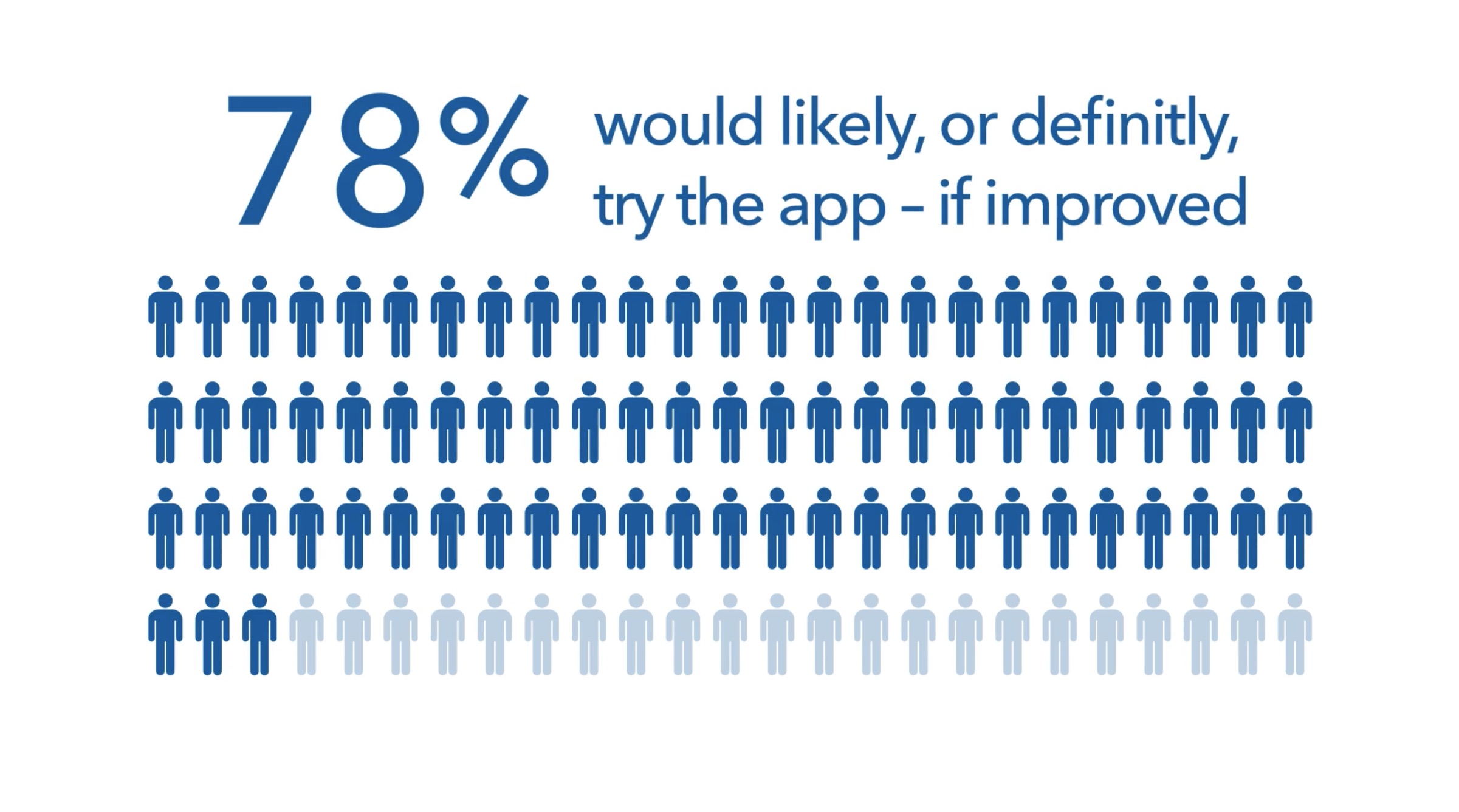
As new students of GBC, we honed in on the user experience issues with the school app. A list- and text-based repository of a significant amount of content, it was complex and not intuitive. We sourced analytics from the digital team and interviewed many students across campus to gain insight into what students needed, how the app functioned and the gap in between.
Based on the survey results, we identified four options for consideration:
- Improve date-based content with an integrated calendar and homework manager (events and important dates were found in different sections and presented in lists)
- Deliver the news in a user-centred way (it was currently based on channel)
- Integrate STU-VIEW (the student academic portal and dashboard) into the app
- Add campus-specific maps and class locators

Part 1
It’s all about time
Our design approach was two-pronged. First, a greatly-simplified homepage dashboard approach would allow students to customize the interface by choosing the sections that they deemed most important. The second key enhancement was to create a central backbone for the app by bringing ALL date-based information into a single, integrated calendar that contained three structured views (day, week, month). The addition of exam schedules and a homework manager would help students see all of their school information in one place, in a time management context. Different types of content would be categorized and could be toggled to allow students to focus on whatever content interested them.
My contribution to this phase was:
- Content structure analysis and modelling
- Wireframe development of key pages
- GBC brand style analysis for application to designs
- Design and prototype creation of 7 key screens for concept testing
- Prototype testing with students
Part 2
The plan and pitch
Requirements for each of the 14 stakeholders that we identified were then established on a must-should-not basis. Our project definition outlined the scope, inclusions and exclusions, critical success factors, key risks and mitigation, milestone dates as well as a full work breakdown structure and budget allocation. Student interviews, key findings and the case for app redesign were distilled from the 30-page proposal document into an 8-minute pitch video.
My specific contribution was:
- Plan proposal writing
- Illustrations of exhibits and plan document layout and creation
- Videotaping of interviews (initial research and prototype testing)
- Creation of pitch video (story flow, scriptwriting, clip selection and editing, data visualization and animation)
Outcomes
Our interview- and observation-based approach to unearthing the key user issues and then testing our redesign approach showed that the calendar-based structure and simplified access to content was spot-on for students. The disciplined approach to assessing all aspects of the project and using real data and insights were key to this. Working within a budget and using a simple weighted-factor model allowed us to clearly prioritize which areas to focus on – very valuable techniques to ensuring that bias and subjectivity don’t drive intent.